Previous part (11-20): https://electronat.newgrounds.com/news/post/1485180
Day 21: Best Dessert
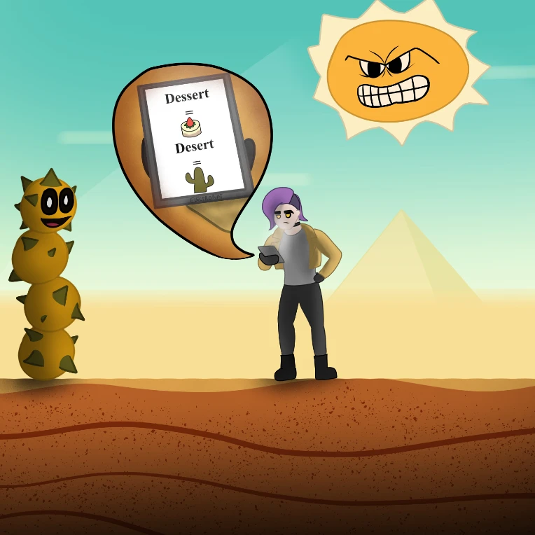
This one was another case of me unable to think of a way to make something interesting using the prompt as it was provided, so I decided to instead make a dumb spelling joke. I really like the background on this one, of course based off of desert levels from the Mario Bros series. I love how the sun turned out, as I feel I did a pretty good job of encapsulating that overly hateful look he has lmao. That said, the foreground and subjects could use a bit of work. The lighting looks a little strange on my character, and don't even get me started on her face. I somehow managed to give her a super wide, melted looking chin. Idk what happened with that. As these next few go on, you can see me start getting frustrated with the design of the character, unsure of how to balance realstic proportions with a stylized character, all while trying to make it visually appealing.
Day 22: Crossover
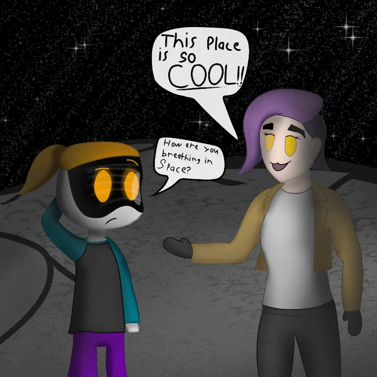
This one was fun. At first I had no idea what to do for this prompt, but then I noticed that Coolusername225 had drawn my character, so naturally I had to return the favor. I'm pretty happy with how their character turned out, especially the face screen, but I LOATHE how I drew Nat in this one haha. I don't know what it is but I really goofed up the proportions and look here, and it was this exact moment that I noticed that the nose-less look really didn't fit the more realistic proportions I was starting to use. It looked fine in the earlier ones where she was a lot more chibi looking, but the more I stretched out the character, the weirder she looked without a nose.
Day 23: Given 1,000,000$
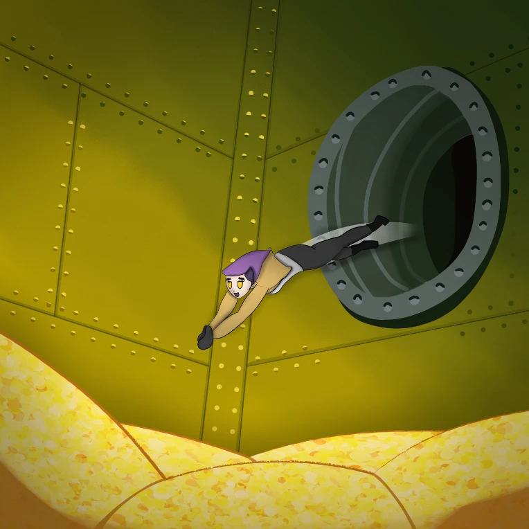
I had to have her Scrooge McDuck dive for this one. (Even if piles of gold are likely worth much more than 1 mil lol). I think I did okay here. The pose is decent, though the legs got a little funky, and it's the first time she got a nose! I'm also just now realizing that I forgot to draw the balcony and ladder that Scrooge had in the entrance of his money vault, so ig she's trapped in there forever now. That's canon. Oops.
Day 24: Their Enemy
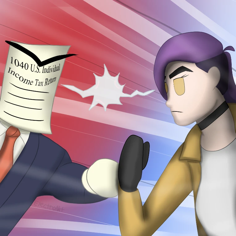
This one I have a love-hate relationship with. I really liked designing and drawing the Taxman, and the posing and effects turned out fine, but something about Nat just seems... off. It might be the dynamic pose, mixed with slightly off proportions and flat lighting, but I'm not 100% sure how to fix it. I think this was a case of me attempting to make her look too realistic while not understanding how to draw realistic humans :/ Something to consider for the future, I suppose
Day 25: Going to Space
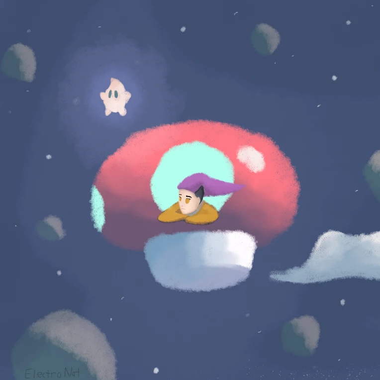
I really like how this one turned out. I honestly think I did a decent job of replicating the style of the Mario Galaxy story books, while adding my own little twist to it. Definitely one of my favorites, though not without its issues. The main thing I dislike about this one has to be how much Nat stands out compared to the rest of the piece. I think it might be because I was using a much smaller brush, which led to her being a bit more intricately detailed than the rest of the image, but I'm not entirely sure how to fix that while still getting the figure across. I think I'd like to revisit this one in the future.
Day 26: Exercising
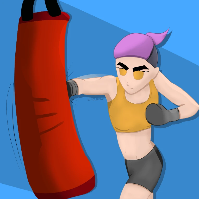
This one was an interesting change of pace and style. I wanted to try an action pose again, like with the table tennis one, but also wanted to have more realistic proportions. I ended up using a picture of myself as a reference, which I think helped a bit, though I might've made the body a bit too realistic while keeping the head very stylized. I also messed up the twist in the body a bit, which I think might make it a bit confusing perspective-wise. In the color department I tried an entirely different style of coloring and shading, this time dividing every color into its own layer and using that to better shade specific parts with colors that matched that object. That part turned out fine I think, though still not perfect.
Day 27: Vacation
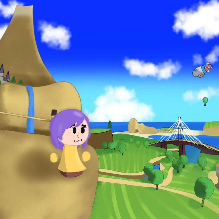
I really like this one; it might honestly be one of my favorites. I adore the wii, moreover any games that involve the Miis, so to be able to draw one of the best locations from those games while putting my littler character in there, I had a ton of fun with this. It's by far the most complicated and indepth backgrounds I've done to date, and I think it turned out pretty solid for what it is. There are minor details I wish I would've spent more time on, like the janky-ass wires on the bridge, but it turned out fine enough I'd say.
Day 28: Getting an Award
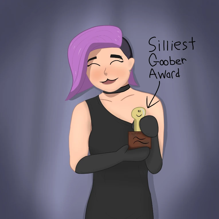
I think this one might have be my favorite instance of Nat's design so far. I feel like I did a much better job of blending more 'realistic' proportions while keeping a stylized face and body that are actually pleasant to look at. I also love how the posing and expression turned out, definetly the new standard for this character's design. That said, the lighting is a bit funky, and a bit flat in places like her chest and arms, but it's an improvement.
Day 29: Party!!!
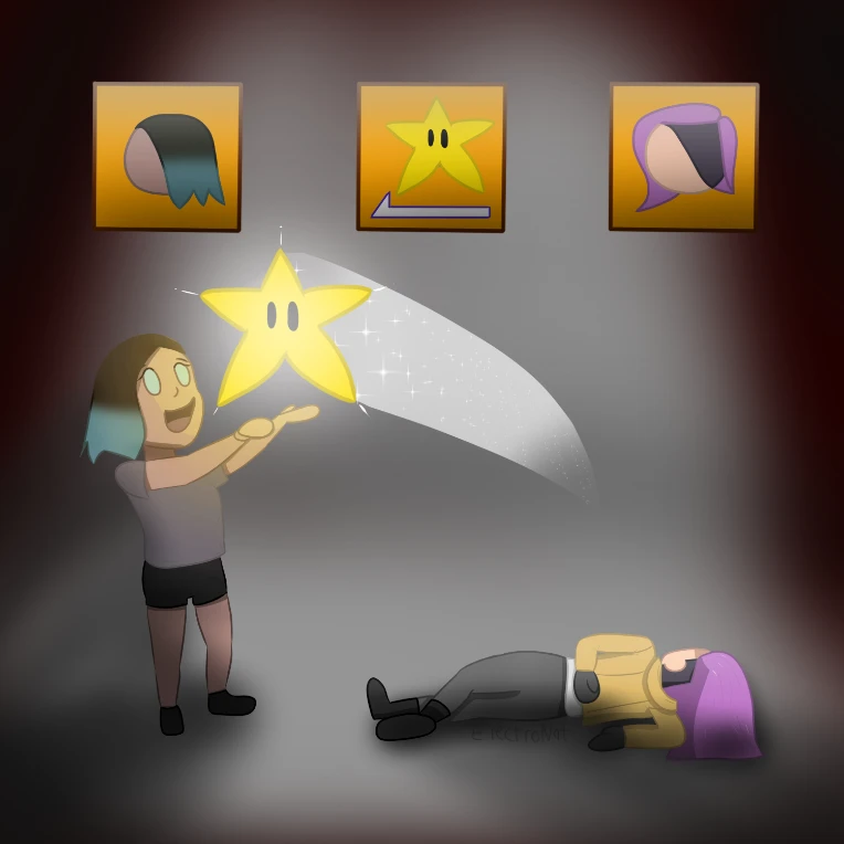
This one was fun. It'd been a while since I drew Celene, and it's also the first time she's gotten a nose too! Woah! The posing was fun too; recreating the iconic family guy death pose, along with Celene's overjoyed expression over robbing Nat of her most prized possession. (I bet mario party has genuinely soured relationships between already strained loved-ones out there). I think I did a good job with the lighting when it comes to the star and it's yellowish glow, but the overall lighting is a bit off in places; especially near Celene's legs. It makes her look a bit detached from the background, which is a problem I am still learning how to fix. Overall a decent second to last piece though, all things considered.
And last but not least, Day 30: Halloween
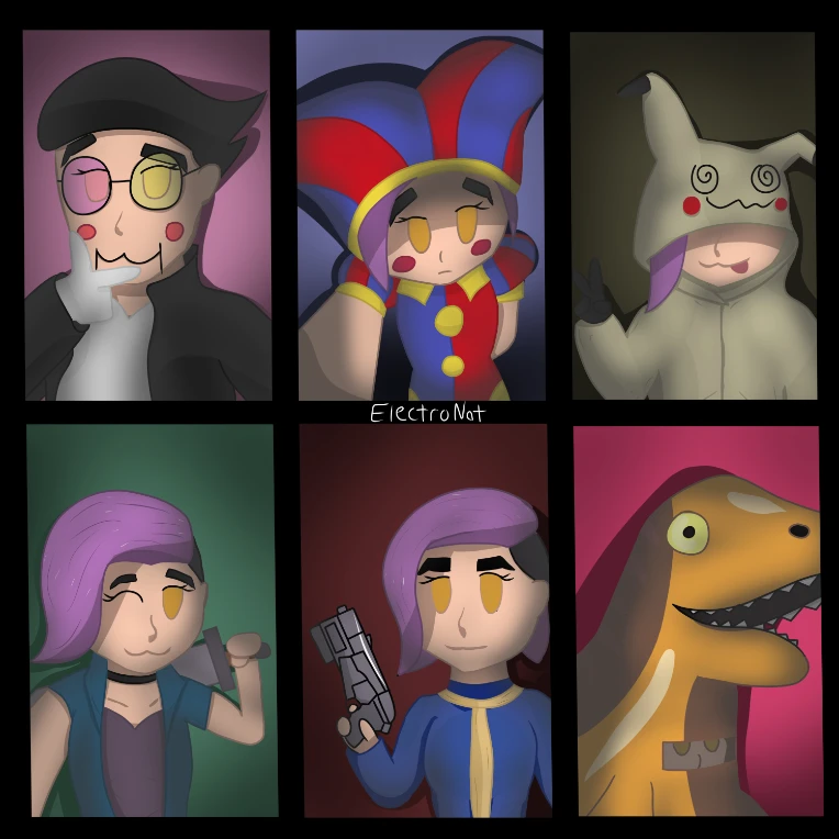
This was probably one of the most ambitions projects I've done so far, and intentionally so. I knew I had to use everything I'd learned so far to make the best culmination of my learned skills throughout the month that I could, and I believe I delivered. The character sketches alone took several hours to get right, not to mention the line art, coloring, shading etc. I probably spent about 6-7 hours on this one (occasional short breaks included). It was a grind, but I am incredibly proud of how this turned out, doubly so when I look back at everything I'd made up until this point! I do still notice the little mistakes here and there, and I know I have a long way to go, but I am very much impressed by my improvement over this time.
And that's everything! I've said it before and I'll say it again: this was a ton of fun. I've never hit art this hard before, much less digital, so it was nice having an excuse to do so. Tons of thanks to Oddlem for hosting this, as well as to everyone who took part! I've loved seeing what everyone else was making, along with sharing my own work and getting feedback and support. This has been a great introduction to newgrounds for me, and I look forward to taking part in more events in the future! Thanks if you read this far :)
Okay, that's all the time I've got. I've gotta get back to playing Animal Crossing New Leaf on my Nintendo 3DS
Full thread for those interested: