00:00
00:00
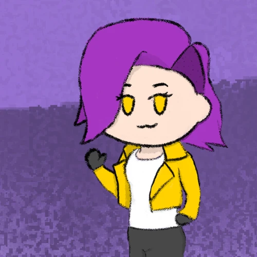
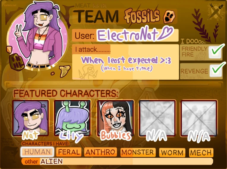
ElectroNat
Recently remembered I owned a drawing tablet

Nat @ElectroNat

Age 22, Female

Artist

Self-Taught (Very much WIP)

Someplace

Joined on 5/6/21

Level:
10
Exp Points:
992 / 1,110
Exp Rank:
68,765
Vote Power:
5.22 votes
Art Scouts
5
Rank:
Civilian
Global Rank:
> 100,000
Blams:
0
Saves:
8
B/P Bonus:
0%
Whistle:
Normal
Medals:
85
Supporter:
1m

ElectroNat's News

Posted by ElectroNat - 7 days ago


I've met a lot of cool ppl thru newgrounds in the few months of actively participating and someone said networking is good, so I made a BlueSky account! I understand this is what all the cool kids are using since Twitter shat itself. I've never been a huge social media fan, but thought this could be a fun way to reach out a bit more, so yee


Tags:

5

Posted by ElectroNat - 2 weeks ago


Previous part (11-20): https://electronat.newgrounds.com/news/post/1485180


Day 21: Best Dessert

iu_1294013_9191525.webp

This one was another case of me unable to think of a way to make something interesting using the prompt as it was provided, so I decided to instead make a dumb spelling joke. I really like the background on this one, of course based off of desert levels from the Mario Bros series. I love how the sun turned out, as I feel I did a pretty good job of encapsulating that overly hateful look he has lmao. That said, the foreground and subjects could use a bit of work. The lighting looks a little strange on my character, and don't even get me started on her face. I somehow managed to give her a super wide, melted looking chin. Idk what happened with that. As these next few go on, you can see me start getting frustrated with the design of the character, unsure of how to balance realstic proportions with a stylized character, all while trying to make it visually appealing.


Day 22: Crossover

iu_1294014_9191525.webp

This one was fun. At first I had no idea what to do for this prompt, but then I noticed that Coolusername225 had drawn my character, so naturally I had to return the favor. I'm pretty happy with how their character turned out, especially the face screen, but I LOATHE how I drew Nat in this one haha. I don't know what it is but I really goofed up the proportions and look here, and it was this exact moment that I noticed that the nose-less look really didn't fit the more realistic proportions I was starting to use. It looked fine in the earlier ones where she was a lot more chibi looking, but the more I stretched out the character, the weirder she looked without a nose.


Day 23: Given 1,000,000$

iu_1294015_9191525.webp

I had to have her Scrooge McDuck dive for this one. (Even if piles of gold are likely worth much more than 1 mil lol). I think I did okay here. The pose is decent, though the legs got a little funky, and it's the first time she got a nose! I'm also just now realizing that I forgot to draw the balcony and ladder that Scrooge had in the entrance of his money vault, so ig she's trapped in there forever now. That's canon. Oops.


Day 24: Their Enemy

iu_1294016_9191525.webp

This one I have a love-hate relationship with. I really liked designing and drawing the Taxman, and the posing and effects turned out fine, but something about Nat just seems... off. It might be the dynamic pose, mixed with slightly off proportions and flat lighting, but I'm not 100% sure how to fix it. I think this was a case of me attempting to make her look too realistic while not understanding how to draw realistic humans :/ Something to consider for the future, I suppose


Day 25: Going to Space

iu_1294017_9191525.webp

I really like how this one turned out. I honestly think I did a decent job of replicating the style of the Mario Galaxy story books, while adding my own little twist to it. Definitely one of my favorites, though not without its issues. The main thing I dislike about this one has to be how much Nat stands out compared to the rest of the piece. I think it might be because I was using a much smaller brush, which led to her being a bit more intricately detailed than the rest of the image, but I'm not entirely sure how to fix that while still getting the figure across. I think I'd like to revisit this one in the future.


Day 26: Exercising

iu_1294018_9191525.webp

This one was an interesting change of pace and style. I wanted to try an action pose again, like with the table tennis one, but also wanted to have more realistic proportions. I ended up using a picture of myself as a reference, which I think helped a bit, though I might've made the body a bit too realistic while keeping the head very stylized. I also messed up the twist in the body a bit, which I think might make it a bit confusing perspective-wise. In the color department I tried an entirely different style of coloring and shading, this time dividing every color into its own layer and using that to better shade specific parts with colors that matched that object. That part turned out fine I think, though still not perfect.


Day 27: Vacation

iu_1294019_9191525.webp

I really like this one; it might honestly be one of my favorites. I adore the wii, moreover any games that involve the Miis, so to be able to draw one of the best locations from those games while putting my littler character in there, I had a ton of fun with this. It's by far the most complicated and indepth backgrounds I've done to date, and I think it turned out pretty solid for what it is. There are minor details I wish I would've spent more time on, like the janky-ass wires on the bridge, but it turned out fine enough I'd say.


Day 28: Getting an Award

iu_1294020_9191525.webp

I think this one might have be my favorite instance of Nat's design so far. I feel like I did a much better job of blending more 'realistic' proportions while keeping a stylized face and body that are actually pleasant to look at. I also love how the posing and expression turned out, definetly the new standard for this character's design. That said, the lighting is a bit funky, and a bit flat in places like her chest and arms, but it's an improvement.


Day 29: Party!!!

iu_1294021_9191525.webp

This one was fun. It'd been a while since I drew Celene, and it's also the first time she's gotten a nose too! Woah! The posing was fun too; recreating the iconic family guy death pose, along with Celene's overjoyed expression over robbing Nat of her most prized possession. (I bet mario party has genuinely soured relationships between already strained loved-ones out there). I think I did a good job with the lighting when it comes to the star and it's yellowish glow, but the overall lighting is a bit off in places; especially near Celene's legs. It makes her look a bit detached from the background, which is a problem I am still learning how to fix. Overall a decent second to last piece though, all things considered.


And last but not least, Day 30: Halloween

iu_1294022_9191525.webp

This was probably one of the most ambitions projects I've done so far, and intentionally so. I knew I had to use everything I'd learned so far to make the best culmination of my learned skills throughout the month that I could, and I believe I delivered. The character sketches alone took several hours to get right, not to mention the line art, coloring, shading etc. I probably spent about 6-7 hours on this one (occasional short breaks included). It was a grind, but I am incredibly proud of how this turned out, doubly so when I look back at everything I'd made up until this point! I do still notice the little mistakes here and there, and I know I have a long way to go, but I am very much impressed by my improvement over this time.


And that's everything! I've said it before and I'll say it again: this was a ton of fun. I've never hit art this hard before, much less digital, so it was nice having an excuse to do so. Tons of thanks to Oddlem for hosting this, as well as to everyone who took part! I've loved seeing what everyone else was making, along with sharing my own work and getting feedback and support. This has been a great introduction to newgrounds for me, and I look forward to taking part in more events in the future! Thanks if you read this far :)


Okay, that's all the time I've got. I've gotta get back to playing Animal Crossing New Leaf on my Nintendo 3DS


Full thread for those interested:

https://www.newgrounds.com/bbs/topic/1538618


Tags:

3

Posted by ElectroNat - 2 weeks ago


Previous part (1-10): https://electronat.newgrounds.com/news/post/1485168


Day 11: Hobbies

iu_1293811_9191525.webp

I had a lot of fun with this one. I wanted to try out an action pose and accentuate it with some motion effects and the like. I think I did a pretty solid job of conveying what I'm going for here, and I enjoyed making it as overly aggressive as possible. Definite improvements over previous entries in my opinion


Day 12: Romance? Or not!

iu_1293812_9191525.webp

Sis gets no bitches lmaooooo. If I have to be single, so does my avatar. Nah but this one was fun. I had just recently finished playing through the visual novel Our Life: Beginnings and Always and it was excellent; I had to reference it here. The lighting was also neat to play with. It isn't perfect but I think I did an alright job of conveying the 'alone in a dark room with the only light being your laptop' vibe. This was not an uncommon scene in my college dorm rooms back in the day hahaha.


Day 13: With Friends

iu_1293813_9191525.webp

The first appearance of Celene! It was fun designing a friend character for my little OC. Unlike mine, she isn't based off of anyone I know in particular, just a culmination of friends I have or had in the past. Also the going on walks thing, that's a common theme with me and my friends. This one was neat since I had just discovered the fancy background brushes in Clip Studio and had an excuse to use them. It feels a little cheaty since it adds so much detail so easily, so I might not use them as much in the future, but for it worked for what I was going for.


Day 14: Sick Day

iu_1293814_9191525.webp

I had already used my idea for a down-in-the-dumps type beat in my day 6 post, so I wanted to do something different. I thought, if not sick, how about sick as hell? B) This one was dumb lol, but I like it. Trying to break her arms and legs to look like that iconic sonic pose was an interesting trial, and it makes her look a bit odd. That, compared with her lifeless expression kinda makes her look taxidermized hahahaha


Day 15: Celebration!

iu_1293815_9191525.webp

This one came easily to me. I'm a big Terraria fan and the celebration MkII is such a fun item when paired with the missiles that destroy tiles. You can just remove your entire world with a giant rocket launcher, it's great.


Day 16: Something They Love

iu_1293816_9191525.webp

Another prompt that came easy to me. I ADORE ducks. There was a creek not far from my college I'd walk to to watch the ducks go by. In the good times, and in the bad, it was one constant I could return to no matter what, and I'll never forget that. As for the art itself, I like the background. I still used the cheaty pens for the plants and such, but I filled in details like lighting or the cat-tails and I think it turned out nicely.


Day 17: Give them a pet.

iu_1293817_9191525.webp

I've always kind of wanted a pet tarantula. Back when I lived with my parents, I obviously wasn't allowed, as my mom was understandably horrified of them, but even now I'm refraining so as to not dissuade them from visiting. The lines on this one are still pretty darn thicc, and I'd probably clean up the shading/ color a bit, but I like the expressions and poses.


Day 18: Vehicle of Choice

iu_1293818_9191525.webp

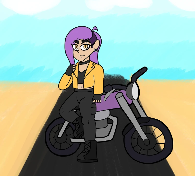
In all honesty, I think motorcycles are sick as hell, but I'm also too much of a coward to own one irl. That said, drawings are invicible, so I can have one in the digital world lmao. I had some fun messing with motion blur on this one, even going so far as to vary how blurred background elements are based on how far away they are. The effect turned out alright, but the art itself looks a bit flat, with the main subject being superimposed over it. I probably could have done a better job of making the motorcycle look like it's actually in the scene with better lighting and a bit of blur on the tires perhaps.


Day 19: Beach Day!

iu_1293819_9191525.webp

I really like this one. Probably one of my favorites of pre-nose Nat lol. It is very much based of of real occurrences as I almost always bring my shovel with me when I go to the beach. My friends sometimes join in too, but I more than often end up flinging sand their way not unlike the picture. I could have probably improved readability with the background a bit, especially with the piles of sand around the hole, as it's hard to tell if they're meant to go up or down. The lighting is also a bit funky in places, but overall I'm still pretty happy with this one.


Day 20: That's GROSS!!!

iu_1293820_9191525.webp

I really liked doing this one. Recreating Kaiba's iconic pose was a blast, and making the lighting and blur as aggressive as possible was a ton of fun. I also finally started using slightly thinner lines, though not as thin as I would later.


Next part: https://electronat.newgrounds.com/news/post/1485259


Tags:

2

Posted by ElectroNat - 2 weeks ago


Hello! This is my first news post so hopefully I'm using this right lol


At last, we've reached the end of OCtober, and I'm happy to say that I successfully completed the challenge without missing a day! This was the first Newgrounds event I've ever taken part in and I must say, it was a ton of fun! I had just heard about it on the first day of October, not long after I had remembered I owned a drawing tablet and decided to get into digital art for the first time. The challenge has been a nice excuse for me to draw and learn, and looking back it makes for a nice timeline of my progress. Having completed all 30 prompts, I thought it might be fun to look back at my art in this post. Maybe compare and critique my own work, as it were. So then, let's take a look!


Day 1: Draw an OC

iu_1293768_9191525.webp

The first drawing of my OC! This was one of the first finished pieces I made, and it looks like dookie lmao. As I was just learning the basics, I hadn't yet experimented with different brushes or layers, so the whole thing is essentially a one-layer sketch with color added and a crappy background. That said, it set the design for my goofy little selfsona, so it isn't without merit I suppose. Things get much better later on, I promise.


Day 2: Hyped

iu_1293770_9191525.webp

This one is more or less the same deal as the first one, although I added the semblance of a background, as well as a second object in frame. I like the idea of this one, but again, the execution leaves much to be desired. I might come back later and redo these earlier ones with the skills I've learned, but we'll see how I feel later.


Day 3: Alternate Universe

iu_1293769_9191525.webp

While still pretty crude, this one is a comparable step up, with an actual background and an early attempt at shading. I also finally started using layers, which helped a bit keeping the objects separated and colored, but the way in which I did it still overcomplicated the coloring process.


Day 4: Different Outfit

iu_1293771_9191525.webp

I think this might be my favorite from my hasn't-learned-G-pen-yet era. Designing and drawing the outfit was pretty fun, and I enjoyed making the little background details. Still undercooked, but fun to do nonetheless.


Day 5: At Work

iu_1293772_9191525.webp

I like the energy of this one, but the execution is just kinda gross to me. Like, I'm not the best at proportions or style now, but this is straight up children's drawing level right here. This is one I would very much like to redo at some point, as it's a cute scene that just looks... well, like that.


Day 6: Bad Day

iu_1293773_9191525.webp

I had the idea of this one a few days before Oct 6. I had just rewatched Smiling Friends season 2 and I wanted an excuse to reference the pose that Pim ends up in after getting absolutely zoinked in space. This one was fun, and an early attempt at intense lighting. The execution is once again kinda crusty, but this was the last of my sketch pen era.


Day 7: Different Time Period

iu_1293774_9191525.webp

She finally did it! She found the g-pen! Holy cats! Ok but yeah, this was a major step up from my first six drawings. I had been watching digital art tutorials for a few weeks at this point, but wasn't really integrating what I was learning until now, and it shows. Who knew that at least trying to render a piece made it much more visually appealling? Crazy, right? I'm still really proud of this one, even if it still has a lot of room for improvement. This is one I'd love to redo in a year or so's time to compare my progress.


Day 8: Movie Theater

iu_1293775_9191525.webp

The second in my g-pen era, and a lot more ambitious as well (by my standards). There's a lot going on here, and it took a while to get all the assets done. I admittedly cheated a bit, as the chairs are all duplicates, just with minor adjustments to lighting or skew, but eh, it's fine. Also SPAMTON SPOTTED!!111!! (I'm not obsessed I swear)


Day 9: Their Parents

iu_1293776_9191525.webp

This is where I started to play with proportions a bit more. I liked having a cartoony style, but I had been doing a bunch of studies of more realistic humans and wanted an excuse to play with that knowledge. The theme was also fun too, as this is totally something that I do to this day. (And apparently my mom before me did the same when she was younger, so it runs in the family I suppose)


Day 10: Favorite Snack

iu_1293777_9191525.webp

Ok but like, I LOVE pretzel M&M's. They are my lifeblood. They are my soul. They are my all. I'm not religious, but even I could see a loving god blessing this earth with a boon such as this. I would die for pretzel M&M's. I would give up firstborn son for pretzel M&M's. You don't want to know the lengths of which my yearning for these chocolatey spheres of heavenly glory would take me. So yeah, they're alright I guess lmao


Oh shoot, I didn't realize you could only include 10 pictures in a news post lol, guess I gotta split this up into thirds!


Part 2: https://electronat.newgrounds.com/news/post/1485180


Tags:

4